India has over 200 million Hindi native internet users. Almost none of the interfaces they use are designed for them.
UX Research / Bilingual Interface Design
Ongoing- Thesis
My Hypothesis
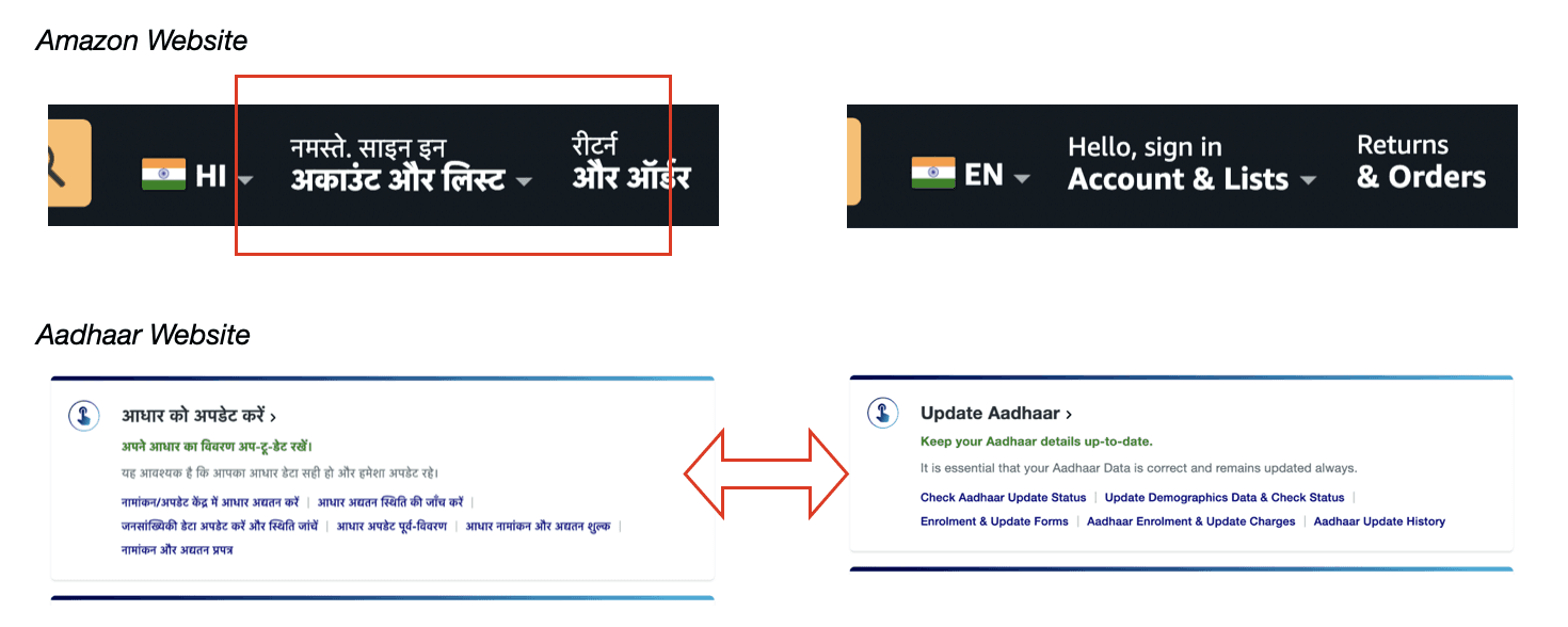
The interfaces break when switching between languages. There is a gap in documentation for Devanagari interface design.
My Approach
Problem Space
Explore existing guidelines for devanagari. Compare scripts. Identify interface issues.
Controlled User Study
Conduct comparative A/B testing across scripts and font sizes.
Solution Space
Develop & test guidelines based on study findings.
Existing Standards
No major framework (Material, HIG, W3C) provides designer-accessible guidelines for Devanagari or bilingual interfaces.
Govt Led
TDIL-(WSI)
GIGW-3.0
C-DAC- GIST
BIS- ‘Akshar’ Draft Document
Open Source
Google Material
W3C
The phenomenon of differences in layout requirements for scripts was mentioned briefly in Google Material 2 but skipped over in Material 3.
W3C provides a base, but Devanagari-specific issues remain unresolved even in their working groups. (Marked orange here).
Govt. initiatives are in collaboration with W3C, so the same unresolved issues persist.


Source- Material 2, W3C.
These standards address encoding, rendering, and accessibility compliance, but none provide actionable typographic guidance a designer can apply when making layout decisions.
Absence of guidelines for Devanagari & Bilingual Interfaces means designers have no reference to work from.
Script Differences
I looked at the comparative structure of the Latin and Devanagari scripts, to understand structural differences.
Latin sits on baseline. Devanagari hangs from headline.
Latin spreads complexity horizontally, while Devanagari does it both ways.

Gridline differences (Same font & font size)
Devanagari has more complexity in grid structure.
Built-in padding for latin, matras occupy space for Devanagari.
Latin has two cases, which devanagari doesn’t.
Webpages Survey
I looked at about 20 bilingual websites, categorised as- Hindi primary & English Secondary, English primary & Hindi secondary.
Using browser dev tools to exxtract CSS values, I noted differences in text rendering across websites as the language switch occurs.
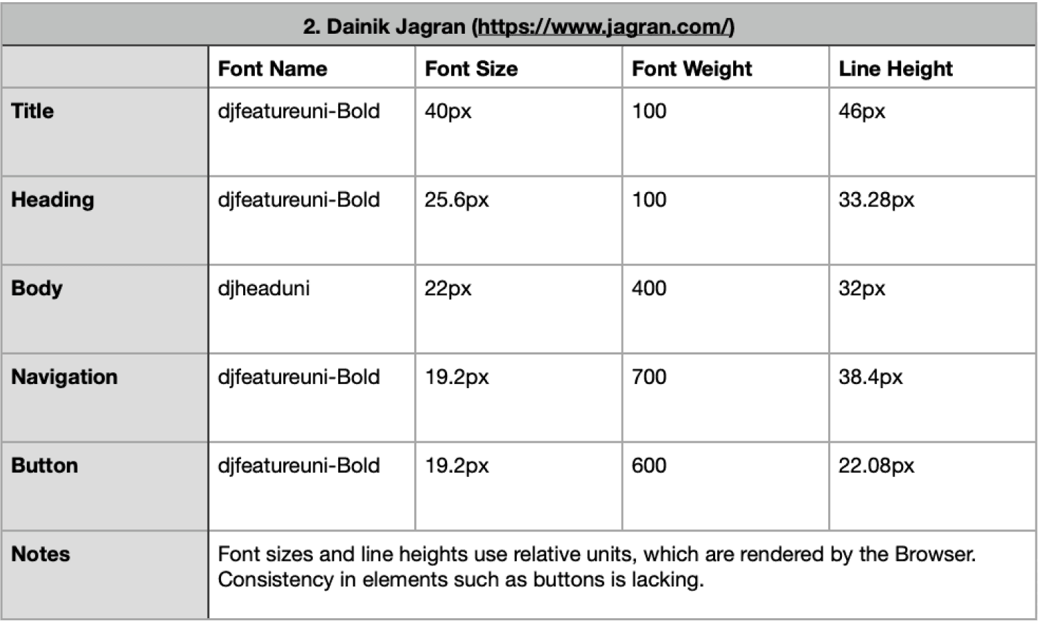

Hindi primary > English secondary interface
Key Findings
Apart from Govt. websites, True bilingual interfaces are rare.
Most Hindi-primary sites have English versions as completely different interfaces with their own conventions.
Noto Sans is the most used network font, but most sites rely on system fallback fonts (Kohinoor on MacOS), causing inconsistent rendering.
Most Devanagari websites use relative units (rem/em). Font sizes are browser-rendered and device-dependent.
The issues cut both ways. Problems appear whether switching from Hindi to English or English to Hindi.
Webpages Audit
I audited five bilingual interfaces using browser DevTools, and made comparative observations between their English & Hindi versions.
These included- Amazon, UIDAI, IRCTC, Patrika, ABP News. These were chosen to include bilingual sites that are English primary & Hindi primary, a high volume e-commerce website, Govt. consumer centric website & an official website, along with content based websites (newspaper).
Parameters compares on were- font name, size, weight, line height, letter spacing, margins, padding, baseline alignment, visual hierarchy, and optical size.
A small validation check (n=3), design students familiar with both scripts in writing and speech, found unanimous agreement on all major identified issues.
Key Observations
Identical CSS does not create visual parity.
Identical font-size, line-height, and padding cause Devanagari to look either smaller, larger, bolder, or more cramped than Latin. Optical adjustment is required.


Source- Amazon product interface
Local font fallback breaks consistency. Relying on system fonts (e.g., Kohinoor on macOS) makes Devanagari render inconsistently across devices. A single, served font family is the minimum standard.
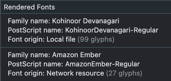
Source- Computed CSS from Amazon hindi interface
Vertical alignment and container clipping are universal problems. Layouts designed for Latin metrics clip Devanagari text and throw it off-centre in buttons and nav bars. Container models must be script-aware.

Source- Navigation elements text alignment from UIDAI interface

Source- Button elements container alignment from IRCTC interface
Visual hierarchy breaks when scripts compete.
Weight mismatches and Latin ALL CAPS (which Devanagari lacks) break visual parity. Hierarchy must be calibrated per script.

Source- Product description from Amazon hindi interface

Source- Navigation elements from ABP news interface
‘Bilingual’ often means Latin-first, Devanagari-second. Even on "Hindi-first" sites, UI sections, placeholders, and font sizes often favor Latin. True bilingual design requires equal treatment.

Source- Form elements from Patrika English & Hindi interfaces

Source- Form element from ABP news Hindi interface
What This Means
Every designer building a Devanagari interface today is making typographic & layout decisions based on intuition because no evidence-based guidelines exist. This project tries to fill the gap.
Way Ahead
How does the difference in font size & CSS properties affect comparative readability? Is using the same font size for both scripts for an interface the right way?
The audit showed that same CSS values do not correspond to the same visual parity. The next step is to test how it affects the readability of the content.
In the MTP, I aim to design a study to understand the comparative legibility & readability of the two scripts.
I will conduct a readability study which involves reading out passages to understand reading speed for various font sizes that are to be used for an interface. This will compare the relative match between font sizes of both scripts. The underlying hypothesis is that same font sizes do not correspond to the same readability across these two scripts.
Based on the study results, I intend to develop guidelines specifically for designers which address the design of bilingual interfaces.
Until these guidelines exist, every bilingual interface in India is a workaround. This project is an attempt to change that.